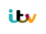
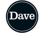
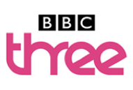
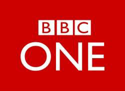
     | E4 use a bright purple colour in their logo, so it is appealing to the viewers. Also quite a bold font is used to attract viewers. The producers use corporate identity very well when they designed this logo as it stands out and people think of this logo when someone mentions the channel ‘E4’. ITV use a few different colours in their logo to attract their viewers and also use a bold font but with no capitals in it. It links with corporate identity because most people no ‘ITV’ by their logo; the first thing they think of is the logo, so this is the overall image of the company. Dave’s logo is much more simple than ITV or E4, using just black and white colours in it with just a bold statement saying the word ‘Dave’. This is a very effective way of linking it with corporate identity as people recognize ‘Dave’ for its logo. BBC3 use a mixture of bright and dark colours in their logo in order to attract viewers to watch their channel. The font size used varies in this logo, ‘BBC’ part of the whole BBB3 logo is quite bland but the ‘three’ part is bold and effective. The ‘sky Sports F1’ logo have several different colours in it, including dark blue, red, black and the writing is in white. These colours work very well as this logo is eye catching (which is the most important thing a logo could achieve). The font is a good, effective size and it links with corporate identity well as it’s the channels main focal point and people recognize it straight away when they see it. The BBC 1 logo is a lot different to the ‘BBC3’ logo; it’s not as showy and does not stand out as much as ‘BBC3’ logo. The BBC One logo is simpler than ‘BBC3’ and the colour used is very low key with a red background with writing in white. Even thou the colours are not as wild and bright as the ones used in ‘BBC3’, I feel this logo are stands out just as much as it. It’s simple but very effective which is where |
 RSS Feed
